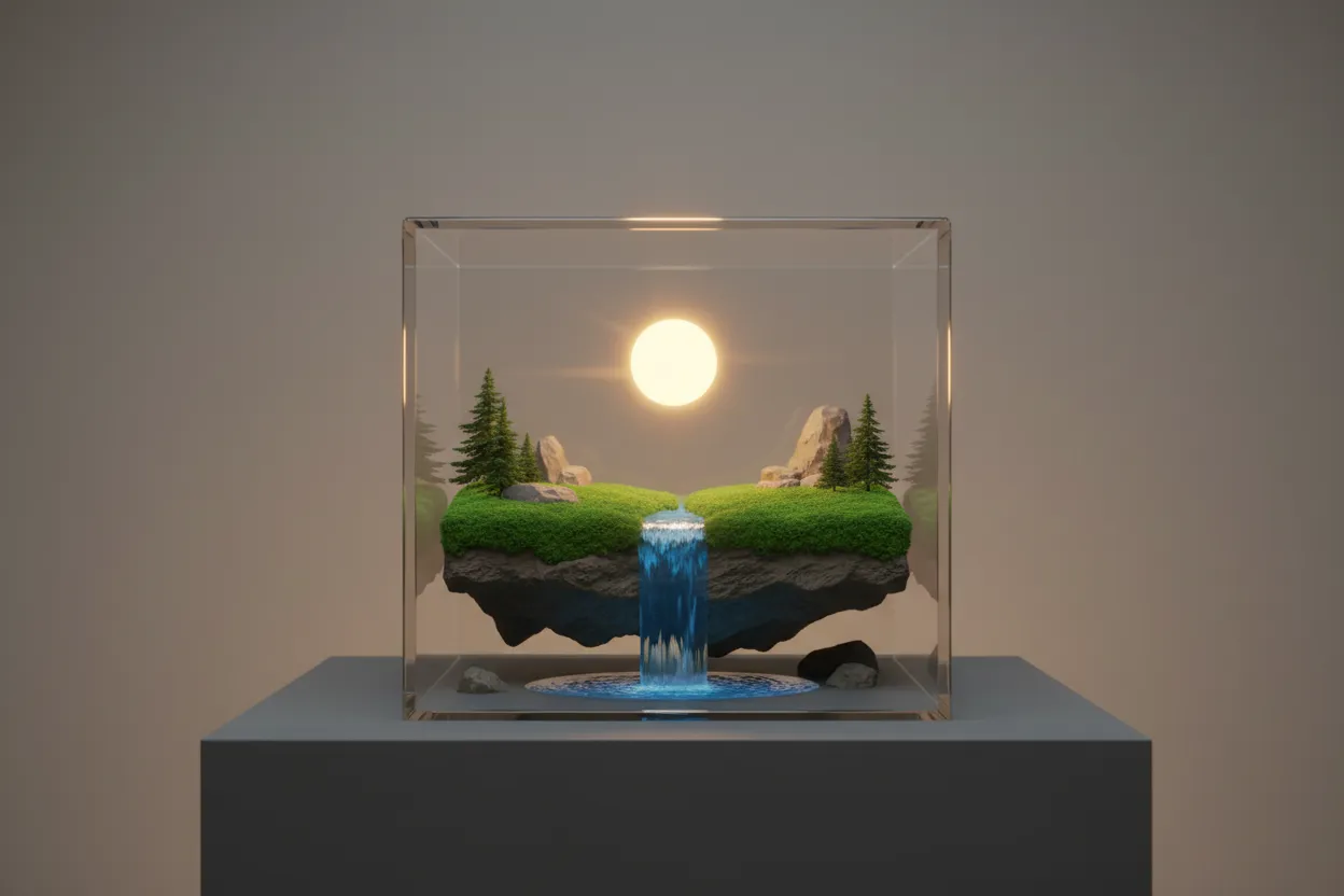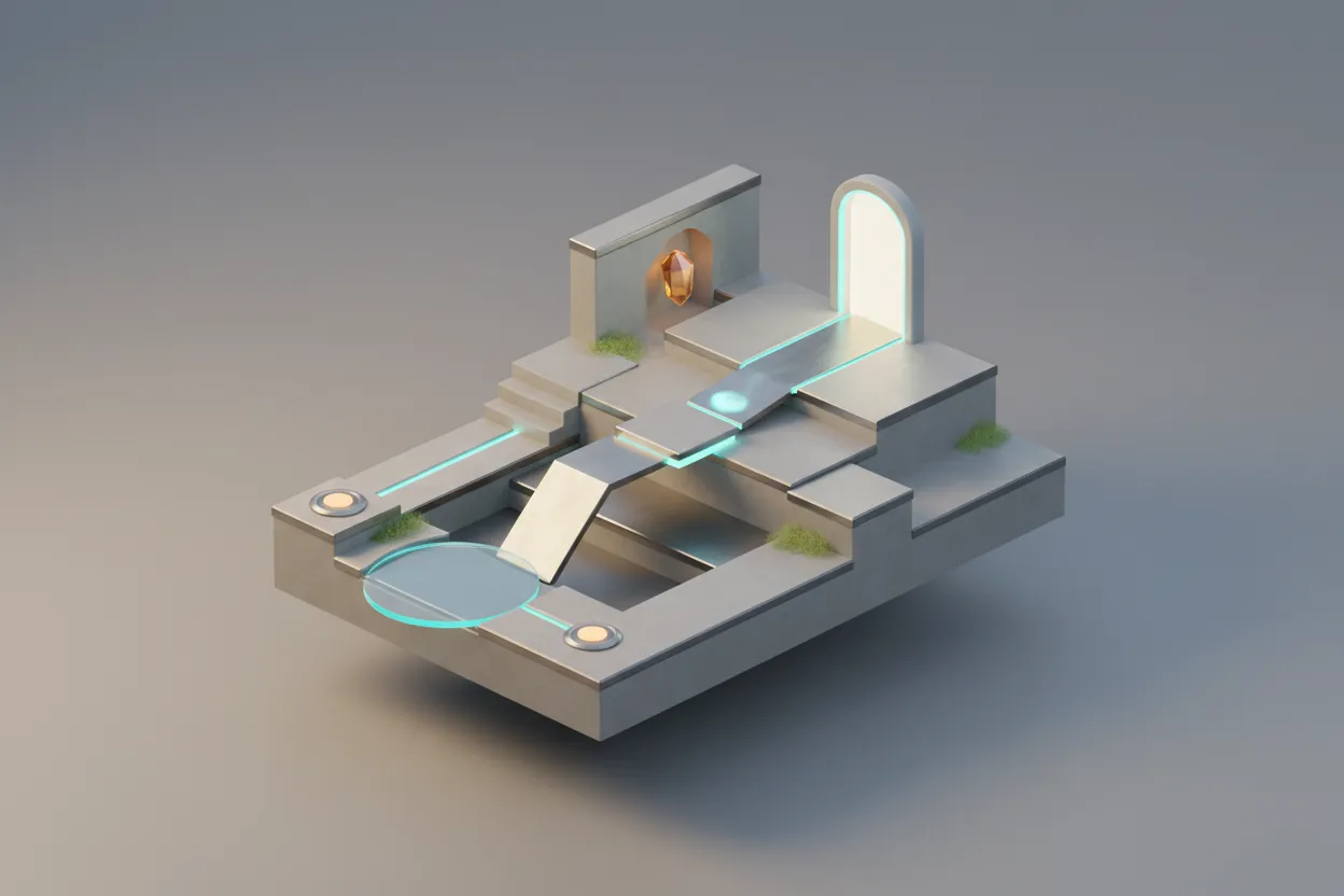
9 Best Examples of Creative Level Design in Games
Great level design can make or break a game, transforming simple mechanics into unforgettable experiences. This article examines nine standout examples where developers mastered the art of guiding players through space, challenge, and discovery. Industry experts share their insights on what makes these levels work and why they continue to influence game design today.
- Bloodborne Rewards Mastery Not Markers
- Aperture Classic Elevates Idea Driven Puzzles
- Guild Wars 2 Champions Dynamic Agency
- Inside Orchestrates Emotion With Silent Guidance
- Dishonored Turns Choice Into Consequence
- Trials HD Trains Precision Through Repetition
- Obra Dinn Weaves Compact Layered Whodunits
- Portal 2 Teaches Concepts Via Elegant Rooms
- Breath of the Wild Sparks Systemic Experimentation
Bloodborne Rewards Mastery Not Markers
I’d choose the PS4 exclusive Bloodborne because its level design is so creative. The game doesn’t give you instructions; instead, you learn by playing. No map, no markers, no hand-holding. I learn the world by playing and dying, which teaches me where I can survive, and which paths I should avoid until I’m stronger. That knowledge becomes my progress.
The way the levels are designed makes every death feel fair. At least most of the time, if I die, it’s because I made a mistake with timing, where I was standing, or how I moved. Tight streets, hidden corners, ambushes, and where enemies are placed all punish careless moves, but if I pay attention and remember the layout, I can find shortcuts and safer routes to go. Finding a shortcut or opening a gate can make a tough level much easier, not because I got better at fighting, but because I gained more knowledge of the area.
Bloodborne’s level design works so well because it matches how you grow as you play. The world doesn’t change, but I do. Areas that seemed too hard at first start to feel familiar and manageable once I learn the layout and the dangers. The environment isn’t just for looks; it teaches me how to survive, so every win feels earned through learning and paying attention.

Aperture Classic Elevates Idea Driven Puzzles
Portal stands out as the most creative example of level design. Each test chamber introduces a single idea, then layers on a new twist so the player learns by doing. The layouts use clear lines of sight, color cues, and safe spaces to show what matters without stopping the flow. As you move forward, puzzles ask you to combine skills you just learned, which builds a steady sense of progress. The levels also pace tension with short moments of calm, so solving a hard room feels earned rather than lucky. Environmental gags and small moments carry the story, making the lab itself feel like a character. When the final act breaks you out of the chambers, the design flips the rules you relied on, and that surprise re-energizes the last stretch. Because the game rarely explains outright and instead proves ideas in the space, players feel clever instead of managed. That trust creates a tight loop of curiosity, testing, and reward that keeps people in the zone. In short, the level design turns a puzzle game into a clear journey of skill building, emotion, and payoffs.

Guild Wars 2 Champions Dynamic Agency
In my opinion, Guild Wars 2 is one of the strongest examples of creative level design done right.
What makes its levels stand out is that they’re built around exploration and events, not linear progression. Maps aren’t just backdrops for quests, but living systems. Dynamic events trigger based on player actions, NPCs move the story forward in real time, and entire zones can change tone depending on what’s happening. That design turns levels into experiences rather than checkpoints.
The verticality is just as important. Hidden paths, jumping puzzles, and layered terrain reward curiosity and skill, making traversal itself part of the gameplay loop. You’re not just moving through space; you’re learning it.
As a result, players feel agency. You can enter the same zone multiple times and have meaningfully different experiences, which keeps the world feeling alive long after the main story is complete. For us, Guild Wars 2 proves that great level design isn’t about complexity, but about giving players freedom, context, and reasons to engage beyond the objective marker.

Inside Orchestrates Emotion With Silent Guidance
I’m a revenue strategist who’s studied buyer psychology and decision-making behavior for 20+ years—turns out level design and customer journey mapping use the exact same principles. Both are about reducing cognitive load while building momentum toward a goal.
“Inside” by Playdead nails this. Every screen teaches you something about the world without a single word, and the levels physically narrow or expand to create emotional tension. When I rebuild go-to-market strategies for clients, I use this exact concept: constrict choices when prospects feel uncertain (like guided onboarding), then open up options once they’re confident. One SaaS client saw close rates jump 28% after we restructured their demo flow to mirror this—fewer decisions early, more control later.
The underwater sections in Inside force you to think in three dimensions suddenly, which is disorienting by design. I do the same thing when diagnosing stalled pipelines—I’ll intentionally shift the frame from “our messaging is broken” to “what does the buyer feel in this moment?” That perspective shift alone has helped teams identify conversion blockers they’d been blind to for months. One client realized their biggest churn driver wasn’t product fit—it was post-sale silence that felt like abandonment.

Dishonored Turns Choice Into Consequence
Dishonored stands out because its level design functions like a decision engine rather than a backdrop. Each area is built as a dense system of vertical paths, sightlines, and overlapping rules. Players are never pushed toward a single solution. Rooftops, alleys, vents, interiors, and supernatural shortcuts coexist, letting strategy emerge moment by moment.
What makes the design memorable is consequence. Levels respond to how they are played. Aggressive choices change enemy density, patrol behavior, and even the emotional tone of later spaces. A quiet approach keeps environments tense but controlled. A violent path creates chaos that lingers. The space itself becomes feedback, not just the score screen.
Levels also teach without instruction. A tallboy guard or a blocked street quietly introduces risk and opportunity at the same time. Players learn by observing, testing, and adapting inside the space. That design respects intelligence and rewards curiosity.

Trials HD Trains Precision Through Repetition
I’m a motocross guy who’s been building custom graphics for 10+ years, not a game dev—but I’ve designed thousands of kits where every panel has to work together visually while fitting complex 3D curves. That’s basically level design for bikes.
Trials HD (and the whole Trials series) nails creative level design because each obstacle teaches you bike physics through failure. You crash 47 times on one section, but each attempt shows you exactly how throttle control and weight distribution work together. When we design graphics kits at Rival Ink, we use the same principle—our install videos break down heat application and positioning in small chunks so riders learn by doing, not reading manuals.
The levels in Trials force you to master one skill before layering on the next, just like our graphics require you to nail cleaning and positioning before you even think about heat-setting. We’ve seen customers go from botched installs to perfect results because they followed our step-by-step approach. One guy told us he saved $200 in shop install fees after watching our tutorial and doing it himself—same satisfaction as finally clearing that impossible Trials obstacle.

Obra Dinn Weaves Compact Layered Whodunits
Return of the Obra Dinn puts all of them on one ship that has been frozen in time. You go through the ship’s decks, rooms, and cargo areas as you try to find out what happened to sixty people. Small features are important because the setting is so small. A body’s position, a broken railing, or a drink that has been knocked over can all be used as signs to figure out what happened.
The way the levels are made helps with this by making one place into several connected crime scenes. You go back to the same places at different times and see how they change as events happen. As you use the structure more, changes become more noticeable right away. The tight organization turns a small ship into hours of research and careful thought.
Portal 2 Teaches Concepts Via Elegant Rooms
Portal 2 is a standout for creative level design. Each chamber introduces one idea, then layers new twists that build mastery without relying on heavy instruction. The layouts guide attention with light, contrast, and sightlines, so discovery feels earned rather than forced. Environmental details and pacing carry the story forward, turning spaces into characters that shape tone and humor. The result is gameplay that feels intuitive, surprising, and deeply tied to the world you’re moving through.

Breath of the Wild Sparks Systemic Experimentation
I keep going back to Breath of the Wild’s level design. Those shrines let me play with physics and experiment, which directly influenced how I prototype AI. Now, when I build that kind of freedom into my own projects, users spend more time discovering things instead of just following the path I set.